Codes and conventions are the fundamental building blocks of
any media text that defines the borders of what is expected, and how to either
adhere to those borders, or to go beyond them. Whilst codes and conventions are
generally kept to appeal to the audience of that genre, by breaking them the
product has the ability to not only appeal to the desired target audience, but
also a wider spectrum of a demographic. When approaching this task, we examined
the various codes and conventions for each text and then evaluated each in
regards to our own design of our products. It was the desire of our group to
create professionally styled creations that could be deemed as believable by
our target audience. I did this by
analysing multiple professional texts and breaking down every aspect of them in
order to understand what it is that makes them successful.
Within the magazine
front cover, we adhered to all of the conventions that I had taken from
existing media such as:


In order to make our magazine trailer look successful and professional, we conformed to these codes and conventions, however we challenged them in order to create a more vibrant and dynamic front cover by using a playful font for a main sell-line that links to the text itself by matching “Halloween” with the cliché font that it is generally associated with. As well as this, we also added the shape of a pumpkin as a puff to tie in with the holiday theme. Generally, magazines tend to stick to much more bland, sans serif fonts on their front cover and plain circular puffs, however we decide to use these methods to contrast against the darkness of the main image, feature article images and the movies mentioned in the sell-lines . By doing this, we not only utilised the stereotypical, silly view of Halloween, but the scary, horror aspect of it.
- A masthead that is striking and relates to the field of focus. “Shutter” is a direct link to that of a photography and film camera used in the production of movies and magazines.

- A small dateline beneath it with the date of issue and price.

- A list of movies featured in the magazine is featured on the left hand side of our cover, and each film links to not only the article, but the “Halloween special issue”.

- A banner placed across the bottom of the frame showing feature article images, all stills of horror films and each with a signifier of the genre. The first on the left features a normal girl with a shadowed being behind her, hinting at supernatural, the middle image is of a young girl that is physically deformed in the face, also showing elements of the paranormal sub-genre, and the final, the first on the right, is of a woman coated in sweat with bedraggled her, resting her hands on her knees with a scared expression, possibly from running from an attacker, and suggests either a slasher or supernatural sub-genre

- A puff that features buzzwords, film titles that both fans of modern and slightly more classic horror would appreciate such as “unseen”, “exclusive” and “Indy” rather than “Indiana Jones”. It is also designed to relate to the theme of the magazine.
- Buzzwords and punctuation that creates excitement and anticipation in the reader in various locations on our product, in the strap-line, sell-lines and puff.

- A main sell line below the main image details the theme of the special issue in a bright, playful display font that would catch the eye of the reader; “Halloween Special”.

- Symbols to appeal to a male audience are featured in the form of a plus sign on the right hand side to subtly signify extra content, the strip of white beside the sell-lines on the left to highlight them against the edge of the frame and the background, and the whimsical shape of the puff itself to appeal to the child within the reader.
- A strap-line above the masthead to not only advertise a main article in the magazine using colloquial slang that would appeal to the audience, but also shows the theme of the special issue in a more straightforward and simple format so as to reiterate what the issue is about.
- Text in the left hand third of the frame, as it is where the eye is first drawn to when looking over the magazine, and a variety of 3-4 fonts and 2-3 colours of text are used so as to not make the cover look too disorganised and unprofessional and so as to not confuse the reader.

In order to make our magazine trailer look successful and professional, we conformed to these codes and conventions, however we challenged them in order to create a more vibrant and dynamic front cover by using a playful font for a main sell-line that links to the text itself by matching “Halloween” with the cliché font that it is generally associated with. As well as this, we also added the shape of a pumpkin as a puff to tie in with the holiday theme. Generally, magazines tend to stick to much more bland, sans serif fonts on their front cover and plain circular puffs, however we decide to use these methods to contrast against the darkness of the main image, feature article images and the movies mentioned in the sell-lines . By doing this, we not only utilised the stereotypical, silly view of Halloween, but the scary, horror aspect of it.
The movie poster has not only a set of codes and conventions
from being of the horror genre, but also of the supernatural/paranormal
sub-genre. As with the front cover, we also included all of the conventions
that we observed in existing media in this product :
- A title that is mysterious and slightly chilling to the audience. This is generally between 1 and 3 words long so that its brevity aids it in resonating within the audience’s minds. Our is a safe 2 words, in the middle of the generally acceptable limit, so as to make it stand out and be memorable for the audience.
- The distorted text of the title reflects the distorted and broken nature of the main character featured, and the serif font of the tagline and release date use sophistication and normality to emphasis the display font of the title.

- A tagline that is short, simple but creates intrigue in the audience either through its succinctness or how it alludes to the narrative of the film. Ours, “She can’t be cured”, makes the audience wonder what it is that is wrong with her, if they could “catch it”, and if she cant be cured, what will happen to her?

- A release date that is either an actual date, or just “Coming Soon”. Whilst the former is useful as it provides the audience with the information needed in order to watch the film, by using the latter we have not only made them curious as to when the film is released, but given a sense of ominous foreboding that the person or being in the main image is coming for them soon.

- Institutional information allows the audience to recognise the actors featured in the movie, as well as the logos of the producing companies. The audience may have seen films created by these companies and that in turn may encourage them to see the film. We have used 3 mainstream film producing companies that appeal to 3 different demographics so as to appeal to the largest amount of people possible.

- The main image reflects the supernatural/paranormal sub-genre and hints at a narrative that features the main antagonist with the blatant horrific imagery of her “true self” in the reflection of the mirror that fills up the frame and uses the black space to emphasise the image.
- The dark, dull colour scheme that connotes the lifelessness and inhuman nature that is shown in the main image.

Each of these were strictly followed as were we not to do
so, then the product would not seem as realistic and professional as we needed
it to be.
A theatrical trailer of the supernatural sub-genre has a
wide set of codes and conventions that it can fit into, however with this
product, the codes are much more lenient. This is because an aim of a trailer
is to scare the audience by showing them the unexpected. This is done in a
variety of ways, and the following are the codes and conventions that we have
featured in our product:
- A disruption in the protagonists life by the antagonist. In supernatural films this is by a person or an object with paranormal ties, and in our film it is the release of the mother, Mary, 15 years after she killed her husband and 2 of 3 children in a demonic attack.
- High angle shots of buildings to give them almost human characteristics of seeming looming and imposing to the audience. We utilised this in the establishing shots of our hospital and our house to create a sense of foreboding; something important and possibly dangerous is going to happen in each of the buildings.
- Emphasised diegetic sounds to emphasise the silence of a scene and to also enhance the fear of the audience and draw them to the edge of their seats.
- Increasingly darker lighting as the trailer progresses to increase the fear of the audience and reflect the increasing darkness within the antagonist, as well as flashing lights to slightly disorientate the audience.
- Contrapuntal sounds of a lullaby played on piano to remaster an innocent sound in a menacing and eerie fashion.
- Cuts to black in tandem with stabs of sound to shock the audience. The stabs generally have a build up of non-diegetic sound before them from silence to make it more effective.
- Non-diegetic sounds such as eerie ambient music of low tones or ghostly moans to help subtly build tension and to highlight a supernatural presence.
- Screams to enhance the fear of the audience by showing the pain or fear of the protagonist.
- A quick cut montage to increase the heartbeat and tension of the audience by showing quick cuts of scenes to a matching audio of emphasised non-diegetic and diegetic sounds that aid the montage in scaring the audience.
- A title and release date to inform the audience of the film title and when it is to be released. As with the film poster, “Coming Soon” is used often to create mystery and intrigue for the audience.
- A sting; a small scene at the end of the trailer that combines horrific imagery and a stab of sound to scare the audience and makes the trailer unforgettable and convinces the audience to go and see the film.
How effective is the
combination of the main product and ancillary texts?
I believe that our promotional package is successful and effective
as we have examined and analysed codes and conventions of our sub-genre, our
target audience, and existing media in order to gain a high understanding of
the expectations of each product and how far we could take each to both match
and defy them. Our products challenge the hegemony of horror in at least one
way to maintain the audience’s interest, and comply in order to gain it in the
first place, as mentioned in the previous section. As well as this, we have
created a successful symbiotic link between each product that ties them together
and promote one another; by seeing one, perhaps the magazine on a shelf, the
poster at a bus stop, or the trailer on the internet, the audience is
immediately reminded of one of the other products. We have achieved this
through using the same main image on the front cover and poster, as is commonly
done with the greater number of film promotion campaigns, and by using the same
font on the title, and that of the tagline and straps, on both the poster and
the trailer. By doing this, we have tethered each promotion together to support
and complement each other to make the film more memorable to the audience, as
it would be in their favourite magazine, they would pass it on the way to work,
and they would see it advertised on their favourite websites.
 |
| Same Main Image |
 |
| Same Main Image |
 |
| Same tagline, title and title font |
 |
| Same title and font |
| Same tagline |
I feel that our products would appeal to our target demographic greatly as we have constantly referred to our target audience profile throughout this project in order to keep in mind what it is that our audience likes, and how we can give it to them. We have featured many suspenseful moments in our trailer to create the adrenaline rush that they want from horror movies as well as the element of the unknown that they enjoy as it adds another layer of fear based upon the deep rooted superstitions of society. This element of the unknown is featured in our poster and cover also in the main image; the audience wouldn't know who or what the being in the image is, and it would make them both freaked out and curious as to the story behind the person’s condition. The magazine itself has a youthful yet sophisticated image that would appeal to the working man, that is still a teenager at heart, through clean cut sans serif fonts, an organised layout, content related to his genre of interest as well as a more in depth look to the technological side to the horror film industry.
What have you learned from your audience feedback?
Our target audience is a male dominated demographic between
the ages of 15 and 30, however many females will enjoy our film also. For our
feedback, we used the same technique that previously used for our pre-production
questionnaires and used an online survey to gain feedback from 15 people in our
target audience as our target demographic are “tech savvy” and this method has
proven to be much easier for both them and ourselves in regards to obtaining
and making sense of the information received. As our product can be very
appealing to both genders, we decided to send the questionnaire out to 8 males
and 7 females, the males having the higher amount as it is mainly intended for
their enjoyment. (Input responses to questionnaire)
We also used an
alternative method for obtaining audience feedback on the trailer, and that is
by holding direct interviews with members of our target audience and recording
their responses so that we could gain a visual feedback as well as a written
one. From each method we gained
very positive feedback for our 3 products as well as some constructive
criticisms.
Do you think the trailer is effective?
- “I think the trailer is effective. It makes me actually want to watch the film”
- “Yeah, it is effective in loads of ways. It does look like a horror film trailer and it did scare me at the end. The montage is really, really, really good. Really good.”
- “Yeah, I think it’s effective for a horror movie trailer because it has those jumpy moments in it.”
- “Yeah, I think it’s really effective. I think the whole build up to the sequence at the end was really good. Even though you said it was slow, I thought it was really interesting and the effects you made with the news bulletin was really effective, and the especially at the end and the sting where you kind of move the camera. I thought that was really good.”
- “The narrative shows me that the woman has gone crazy and after she comes out of hospital her family realise that she’s a bit different; a bit possessed.”
- “Well it’s basically a woman who kills, I’m not quite sure who she kills, she kills her family, and then she obviously gets taken by the police and she goes to a mental hospital. Then they obviously keep her in there, then her daughter goes to collect her and the doctor says she’s all fine and doesn’t have schizophrenia. Then she brings her back to the home and then weird stuff starts happening and then I’m guessing they’re gonna die.”
- “It’s a woman who murdered her family, but her daughter survived, and then her daughter goes to pick her up from the mental hospital because the doctors think she’s got ten better because they thought it was schizophrenia. Then the mum comes home and the daughter’s boyfriend realises that there’s something wrong and then they discuss that maybe it’s not schizophrenia and that it could be a possession. Then obviously those scary bits happen at the end.”
- “The woman kills someone, I didn’t make out who it was, and then gets taken to a mental hospital and they think she has schizophrenia.”
- “Supernatural. It’s definitely a horror film; I’d say it’s a supernatural horror film.”
- “Definitely supernatural.”
- “Supernatural because even from the very beginning when you had the woman being taken away by the police and the camera zoomed in on her eyes; it looked like she wasn’t right. And she had a really white face and stuff like that.”
- “I’d say supernatural slash psychological. Supernatural because of the weird happenings like the closing of the door and the curtains, and then psychological as the woman has a psychological illness.”
- “At the beginning you see the talking over about her, about schizophrenia, at the end it was about the quick shots and the different movements she was making.”
- “It was the montage stuff. You think that it was a slasher at the beginning because she kills someone and then you think “Okay, she’s gonna go on a killing spree”, but then you find out its more supernatural. She’s all in the white gown, she looks a bit pale like a ghost, and she does weird movements with her hands and her head, and it’s like “The Exorcism”; that’s what it reminds me of.”
- “The end was just brilliant. With the quick shots along with the high pitched music builds up a lot of tension.”
- “Definitely, especially in the montage, which is the best bit, because the editing is really fast and sharp, and you don’t know exactly what you see. It’s faces popping up and the lighting is great; it’s dark and you can’t quite make out what is there. It’s mysterious and evil. At the beginning it builds the story. It goes slower at the beginning; it’s kind of telling you the narrative, the background story. It’s got eerie music which makes you feel like “(high pitched) Mmmm, not everything’s okay…It’s a bit weird.””
- “I thought camera, lighting and sound were really used, those were things that really stood out, because I really liked the sort of lullaby tone you had in the background for sound, and the camera at the end; you had something like a strobe effect on the antagonist and that looked really good. The camera in general was really good.”
- “Yeah, I think so. You had loads of good moving camera shots. Lighting was good as in, it was quite dark, but you could still make out what was happening. The lighting was especially good when the woman was going to the police car.”
- “I think the actors were brilliant. You had the two people who were worried about the woman, the woman herself, who was clearly different, and everything just fit together well.”
- “Yeah, most of the time. In terms of acting abilities range, but having a girl, I don’t know if she’s the final girl, but she’s a strong character, she‘s not really scary and she’s not a ‘girly girl’, she’s just there, and she’s got a guy who’s supposed to protect her, but he doesn’t look like he’s gonna protect her, he might die I think. I think there should be some more characters, but I dunno if there would be more characters.”
- “Yeah, I think the actor playing the possessed woman was really good; she looked older.”
- “I felt that the woman looked old so the transformation from the 15 years was good. The other two characters were meant to be teenagers or young adults?”
- “At the very beginning it was a bit slow, you had a lot of build up, and at the end you had a lot of tension. If it was evened out a bit more it would have worked better.”
- “I did like it at the beginning when it was a bit slower, but maybe some more pace when you’re coming straight into the scene because it kind of drags a little bit when it comes to the BBC thing, maybe if it came in stronger. But pretty much, it’s really, really good. It’s pretty good so…”
- “Maybe a few more actual jumpy moments that make you jump because overall the trailer was really spooky but there was nothing made me go “(gasp)” like that, you know? It did give me a chill feeling.”
- “I think at the beginning the sound could have been improved, especially with the non-diegetic voice-overs; sometimes I couldn’t really hear what they were saying, but that’s all I would say.”
From our feedback, we have learned that whilst the storyline
is interesting enough to retain our audience, we may need to revise the pacing
of our trailer so that their first impression is a good one. The feedback received
has convinced us of the effectiveness of our products, and has created a much
more positive perception from the equally positive reactions from our target
audience.
How did you use media
technologies in the construction and research, planning and evaluation stages?
We used a variety of media technologies in the research, planning
and creation of our promotional package. We used physical technology, the
internet and a range of software in tandem in order to achieve the best out of each
technology and to create professional and effective products.
 In regards to physical
technology, we used a Fujifilm Finepix S1500 digital SLR (Single-lens reflex)
camera to take images for our ancillary tasks. With a 10.0 megapixel lens, it
allowed us to take photographs at a higher resolution thus ensuring a much more
professional finish on the final product.
Our original intention was to take the images under normal lighting as
we had assumed that this would guarantee a high quality image, however after
having tried this and reviewing the images, we weren’t quite satisfied. After
discussing the various options we could go for, such as additional or different
lighting or a change in location, we decided to turn all lights off and utilise
the flash feature on the camera. By doing this, we had a much sharper definition
of the mirror and the character and we achieved the image that we had wanted.
In regards to physical
technology, we used a Fujifilm Finepix S1500 digital SLR (Single-lens reflex)
camera to take images for our ancillary tasks. With a 10.0 megapixel lens, it
allowed us to take photographs at a higher resolution thus ensuring a much more
professional finish on the final product.
Our original intention was to take the images under normal lighting as
we had assumed that this would guarantee a high quality image, however after
having tried this and reviewing the images, we weren’t quite satisfied. After
discussing the various options we could go for, such as additional or different
lighting or a change in location, we decided to turn all lights off and utilise
the flash feature on the camera. By doing this, we had a much sharper definition
of the mirror and the character and we achieved the image that we had wanted.

The software and websites used in the research, planning and
creation of our promotional packages performed many different tasks that all worked
in harmony and combined to form our final products.
 |
| Blogger (Compose Mode) |
 |
| Blogger (HTML Mode) |
 The software used was also temperamental in some cases.
Adobe Photoshop, however, was not one of these. Due to previous knowledge of
the program from GCSE studies and previous A-Level studies, I was able to use
this software with practised ease and we were able to produce our ancillary tasks
within a few days. During this creation process, though, I did learn some new
methods to editing images and creating my own brushes. On our main image, we
created the spit of “normal” and “possessed”, however there wasn't enough
horrific imagery in the image that would signify the horror genre. It simply
looked amateur. However, we discovered the “liquefy” tool to use on the
antagonist’s face to give her a much more supernatural image.
The software used was also temperamental in some cases.
Adobe Photoshop, however, was not one of these. Due to previous knowledge of
the program from GCSE studies and previous A-Level studies, I was able to use
this software with practised ease and we were able to produce our ancillary tasks
within a few days. During this creation process, though, I did learn some new
methods to editing images and creating my own brushes. On our main image, we
created the spit of “normal” and “possessed”, however there wasn't enough
horrific imagery in the image that would signify the horror genre. It simply
looked amateur. However, we discovered the “liquefy” tool to use on the
antagonist’s face to give her a much more supernatural image.  |
| Before (Part Two) |
 |
| Before (Part One) |
 |
| After |
As well as this, I created our font for our film title and masthead. For our masthead, I typed out “Shutter” in the desired font, and then overlay an image of a camera shutter on top of it, then trimmed the shutter image to the shape of each letter. I then removed the background of the image, then saved as a PNG before saving as a brush preset. This was also the case for out title after typing out “Darkness Within” in a serif font and then painting paint and blood splatter of the top on another layer. After this, we followed the same process to create a brush. By doing this, we made creating our products and reproducing the title and masthead much easier and far more efficient. This process saved a lot of time and effort and allowed us to focus more on the finer details of our products.
 |
| Adobe Premiere Pro |
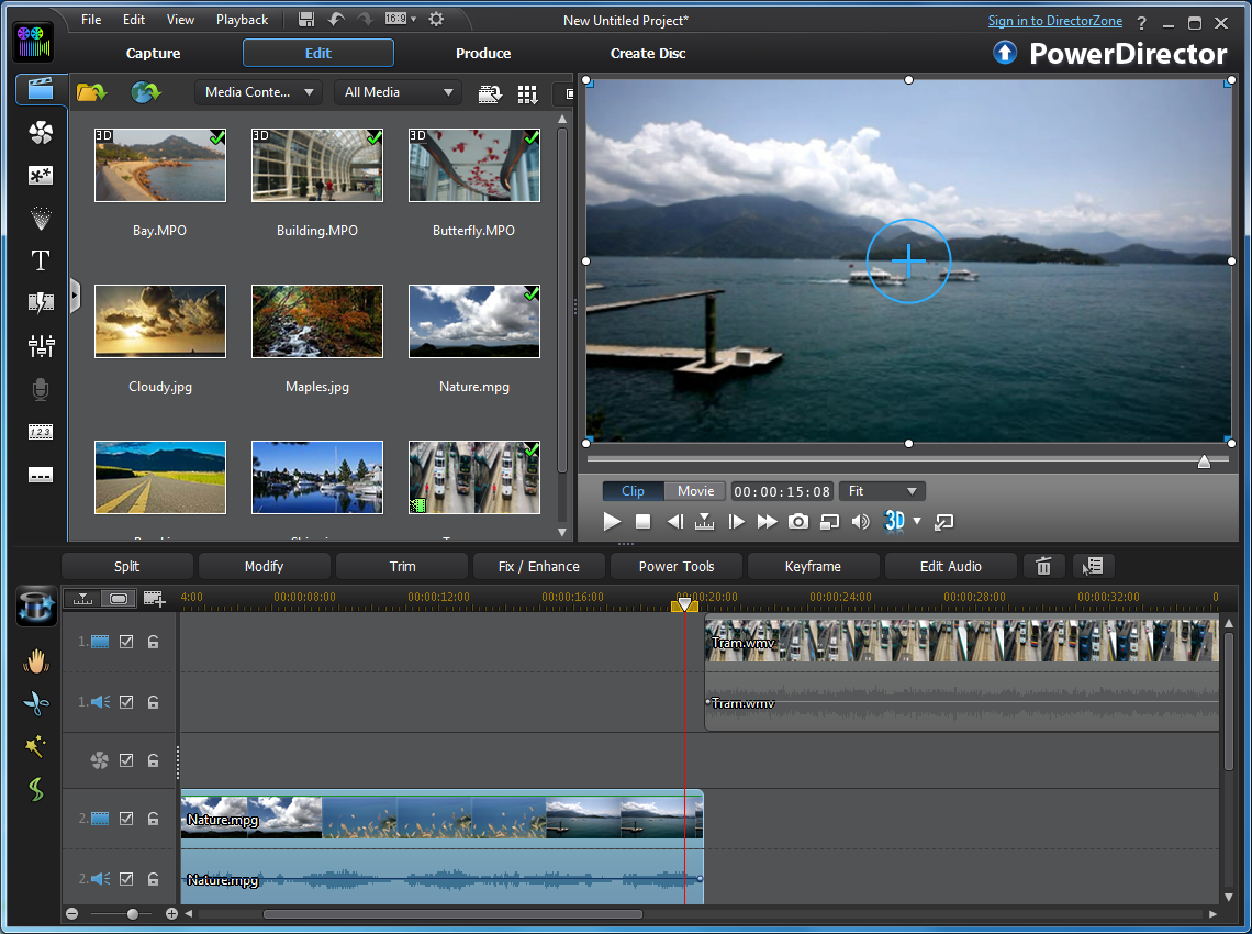 |
| Cyberlink Power Director 11 |
 |
| Sony Vegas Pro 11 |